Hacker News sentiment analysis vs FAANG stocks 🤖
For a while I wanted to see transformers in action (I’m starting to spend time browsing models and apps on Huggingface 🤗 almost as much as reading HN nowdays..) and I have always wondered if the almighty hackernews mood is influenced by big tech stock prices (or vice versa 🤨)
The full code used in this project is available in this repository: https://github.com/danthelion/hn-sentiment.
Getting the data
All hackernews comments are available for free in BigQuery in the following dataset:bigquery-public-data.hacker_news.full
If you want to play around with a large text dataset, I highly recommend it. The schema looks like this:
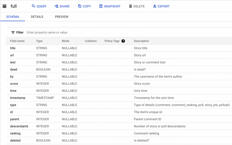
For this project we’ll only use the comment texts and their timestamps. To get our initial data from the past month, I used the following query:SELECT
id AS id,
text AS comments,
DATETIME(timestamp) AS date
FROM
`bigquery-public-data.hacker_news.full`
WHERE
DATE(timestamp) > DATE_SUB(CURRENT_DATE(), INTERVAL 1 MONTH)
ORDER BY date ASC;
Only a month of comments to save on computation time, but it’s easily extendable.
For some light preprocessing we’ll drop NA rows, truncate strings to 512 characters so our model will accept them and sample data from every hour so we can have a fairly balanced dataset. Obviously if you can spare the compute power skip the sampling step.df = df.dropna()df["comments"] = df["comments"].str.slice(0, 512)
df = df.groupby(pd.to_datetime(df.datetime).dt.hour, group_keys=False).apply(lambda x: x.sample(1000))
Sentiment Analysis
For the analysis I opted to use the distilbert-base-uncased-finetuned-sst-2-english model. I also utilize dask to speed up the computation compared to base pandas.
Huggingface provides a state of the art library for transformers that makes this whole thing a breeze.
Applying the sentiment analysis function to our sample is just one line.df = dd.from_pandas(data, npartitions=30)df["sentiment"] = df.apply(
lambda row: task(row["comment"])[0]["label"], meta=(None, 'object'), axis=1)
.compute()
This will give us either an either NEGATIVE or POSITIVE label for each comment in our dataset.df.head() date comment sentiment
2022-5-11 Code i ... NEGATIVE
2022-5-11 I can' ... NEGATIVE
2022-5-11 There ... NEGATIVE
2022-5-11 It's i ... POSITIVE
...
After we have a sentiment value attached to every comment we can aggregate them. For example if we are curious about the average daily mood on HN we can aggregate the dataset as such:df["datetime"] = df["datetime"].astype("datetime64[D]")df[["sentiment", "datetime"]].groupby("datetime", group_keys=False).agg(max_occurrence_agg).compute()
Now as the sentiment values are strings, the aggregation here has to be customized a bit so we can get the statistical mode of the series. It’s compromised of the following steps:def chunk(s):
return s.value_counts()
def agg(s):
return s.apply(lambda s: s.groupby(level=-1).sum())
def finalize(s):
level = list(range(s.index.nlevels - 1))
return s.groupby(level=level).apply(
lambda s: s.reset_index(level=level, drop=True).idxmax()
)max_occurrence_agg = dd.Aggregation("mode", chunk, agg, finalize)
The result of this looks something likedf.head()date sentiment
2022-5-11 NEGATIVE
2022-5-12 POSITIVE
2022-5-13 POSITIVE
2022-5-14 POSITIVE
...
Great! Now we have everything we wanted from the sentiment analysis.
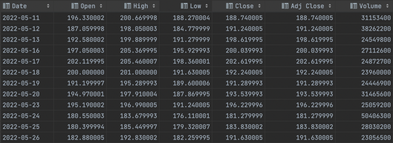
Let’s plot the values against the daily stock value change of $META , downloaded as a .csv from yahoo finance.
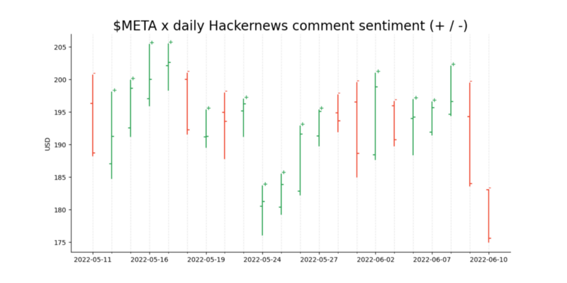
To visualize the daily aggregated sentiments against the changing stock prices I’ll use an OHLC (Open-High-Low-Close) chart.x = np.arange(0, len(df_meta))
fig, ax = plt.subplots(1, figsize=(12, 6))
for idx, val in df_meta.iterrows():
color = '#2CA453'
if val['Open'] > val['Close']:
color = '#F04730'
plt.plot([x[idx], x[idx]], [val['Low'], val['High']], color=color)
# Annotate sentiment on the graph
ax.annotate(val["sentiment"], (x[idx], val['High']), color=color, weight='bold', fontsize=9)
plt.plot([x[idx], x[idx] - 0.1], [val['Open'], val['Open']], color=color)
plt.plot([x[idx], x[idx] + 0.1], [val['Close'], val['Close']], color=color)
# ticks
plt.xticks(x[::3], df_meta.Date.dt.date[::3])
ax.set_xticks(x, minor=True, rotation=45)
# labels
plt.ylabel('USD')# grid
ax.xaxis.grid(color='black', linestyle='dashed', which='both', alpha=0.1)# remove spines
ax.spines['right'].set_visible(False)
ax.spines['top'].set_visible(False)# title
plt.title('$META x daily Hackernews comment sentiment (+ / -)', loc='center', fontsize=20)
And the results!
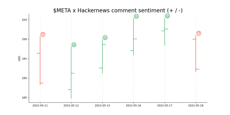
The little + and — signs on the top right corner of the bars indicate if the average sentiment for that days comments (which contain the word meta ) was POSITIVE or NEGATIVE . As we see the model says that for this sample size a negative sentiment indicated a drop in the stock price, while a positive sentiment always indicated an increase.
Zoomed in to a week for better visibility.
Correlation? Maybe, Causation? Probably not. Next time I’ll see if I can predict the price changes based on the sentiment!
Member discussion